![0207_ART_LassieCollective_plaque5.5x5.5[2].jpg](https://images.squarespace-cdn.com/content/v1/5554d744e4b0bc70849be5d1/1520531710947-54X2ONDU871SJ1KJXOVX/0207_ART_LassieCollective_plaque5.5x5.5%5B2%5D.jpg)
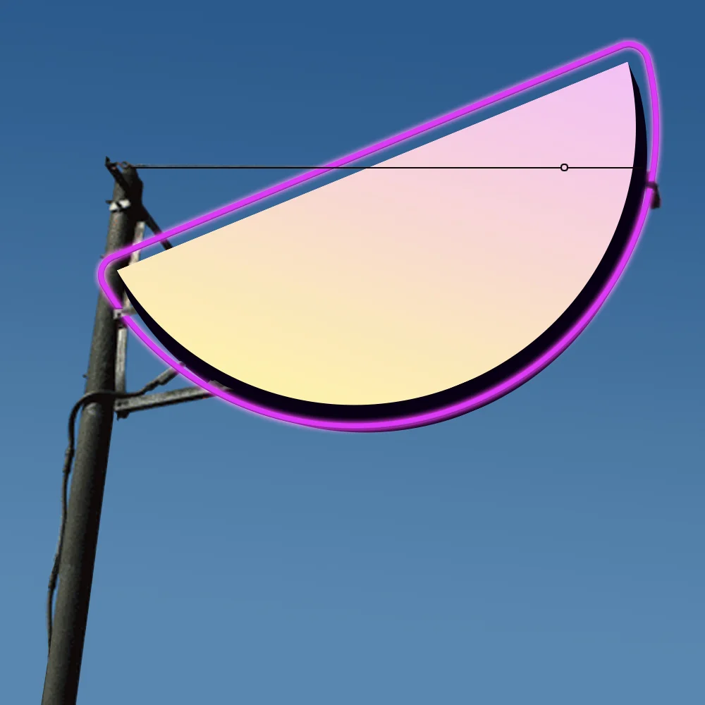
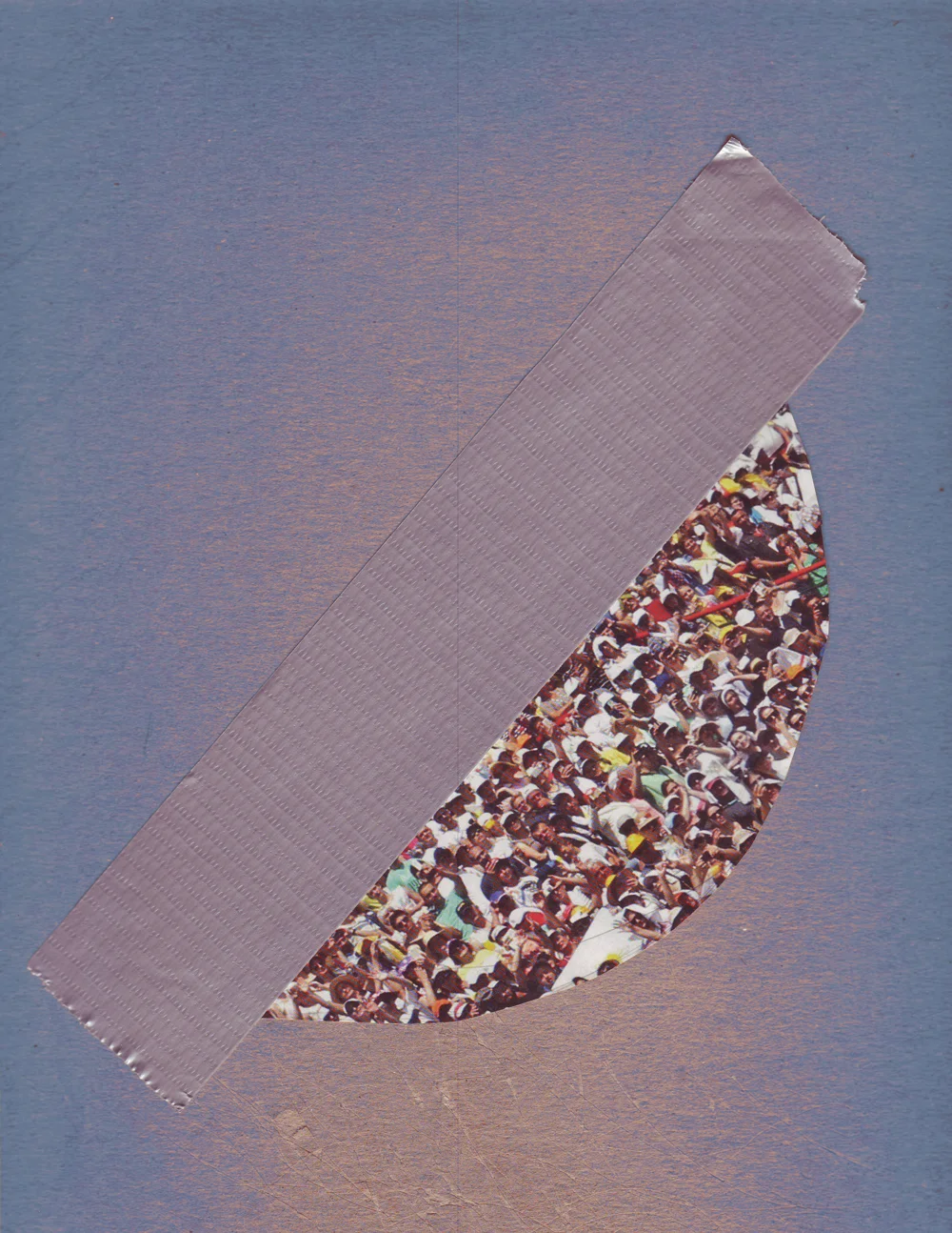
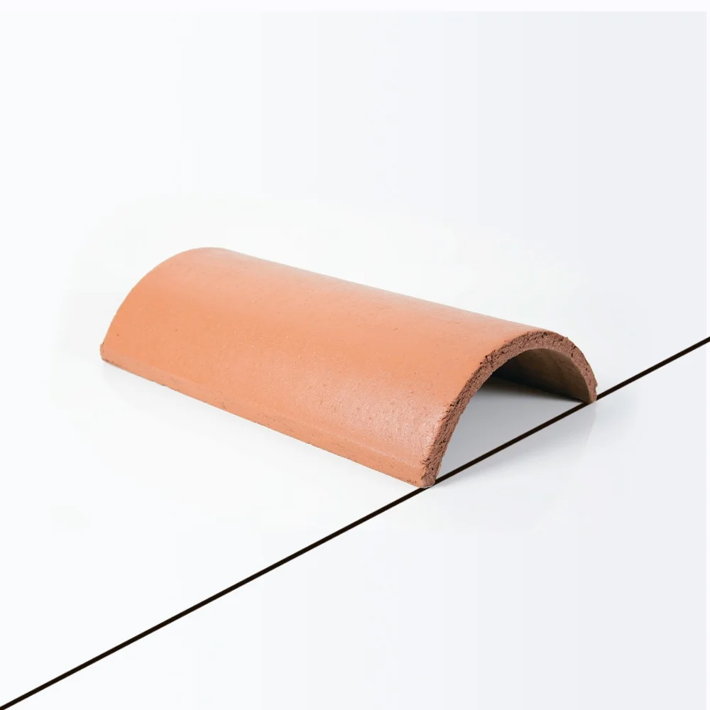
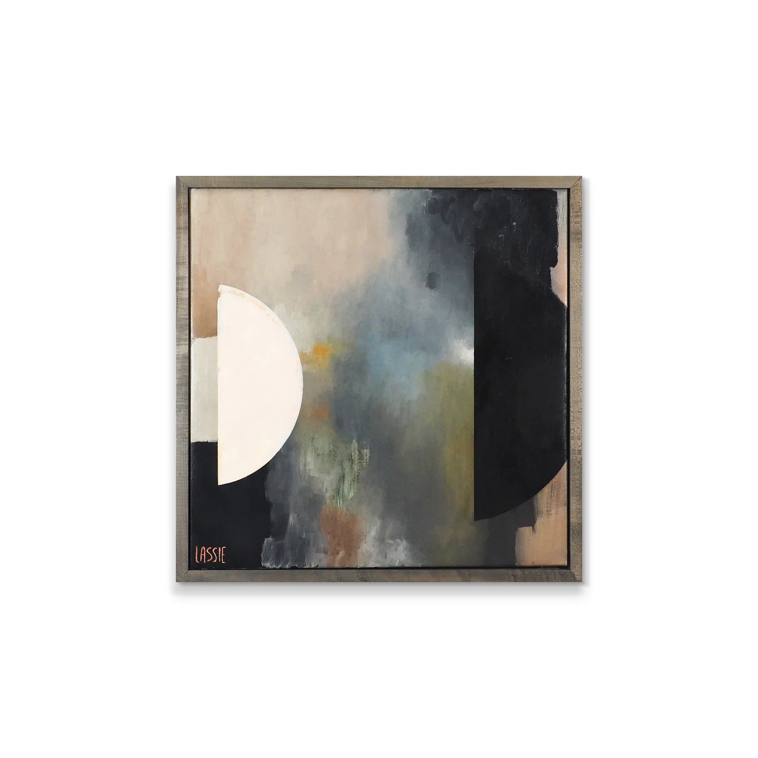
“We started on the computer creating graphics with photos that we had taken or found. We printed using high quality printing on the best canvas we could find, then painted. Unknowingly, the pieces would become entirely covered with oil paint. This is one example of a piece where you can still see a lot of inspiration from the original graphic print into the painting, most prints were left unrecognizable. ”

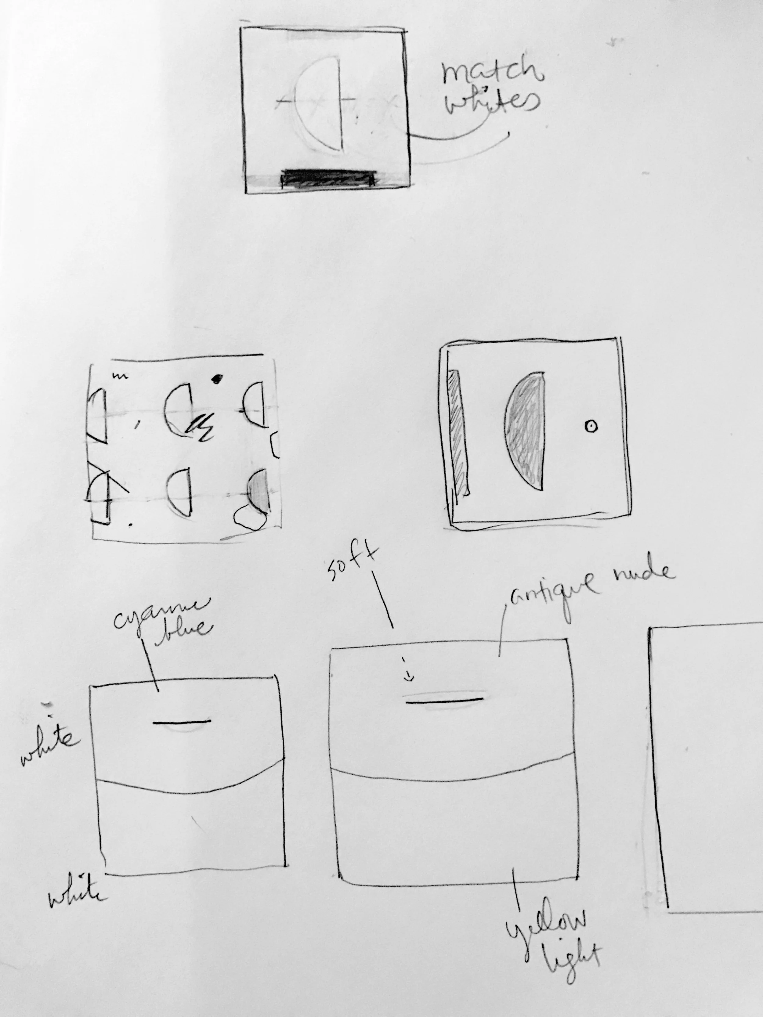
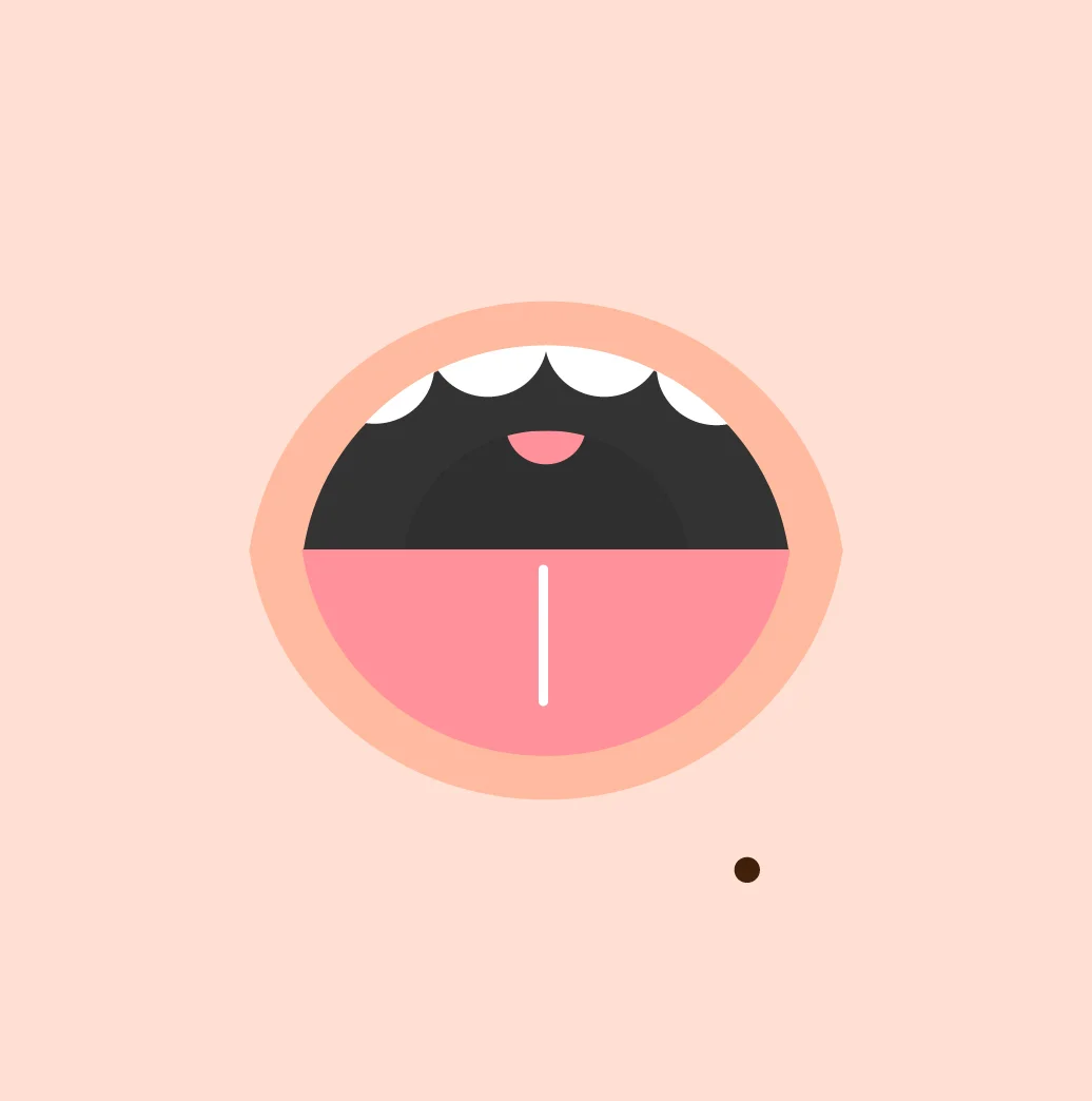
Here are a few examples of graphics we created & printed before we painted:


Where it all started, a daily exercise.


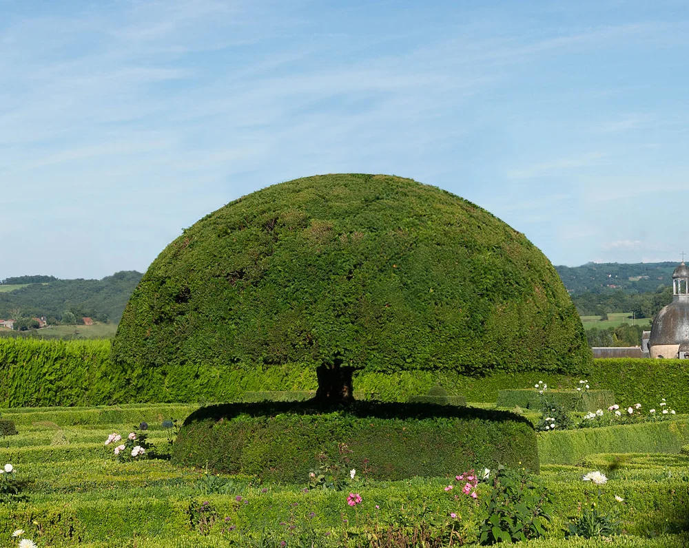


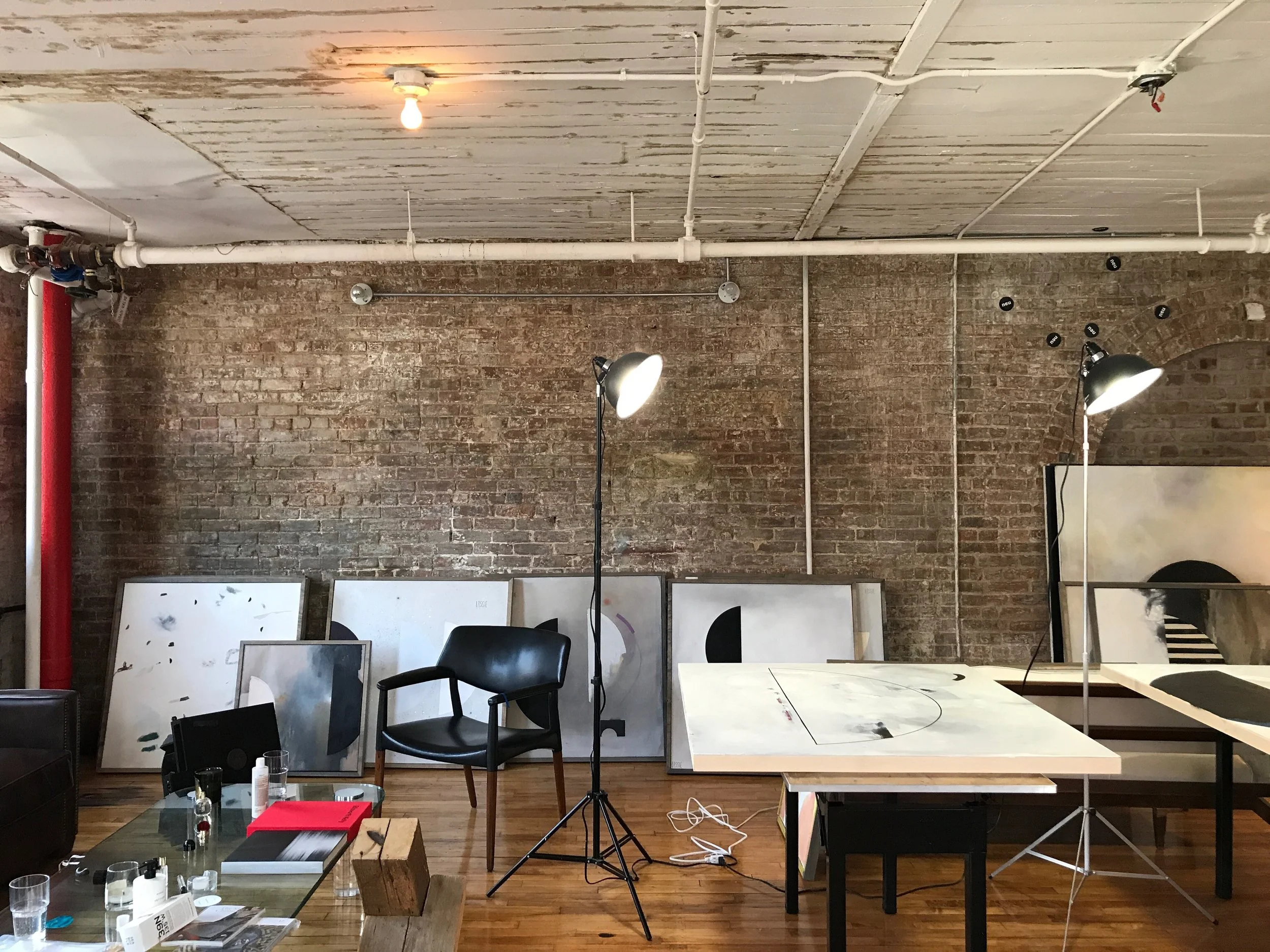
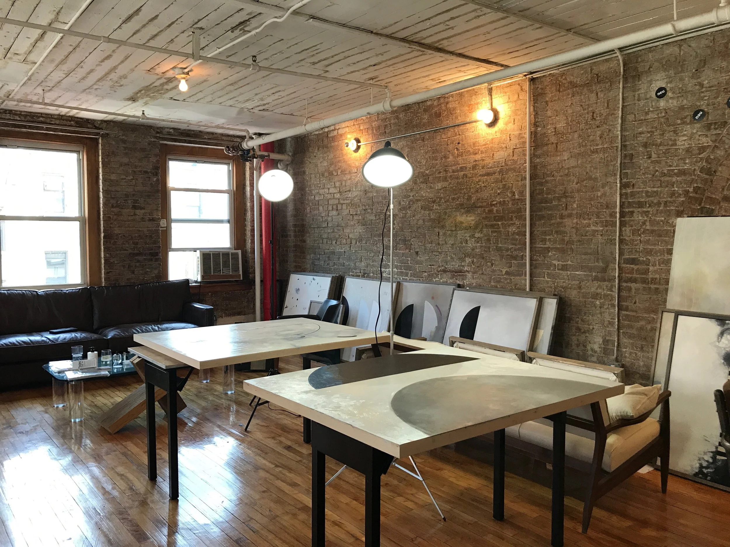
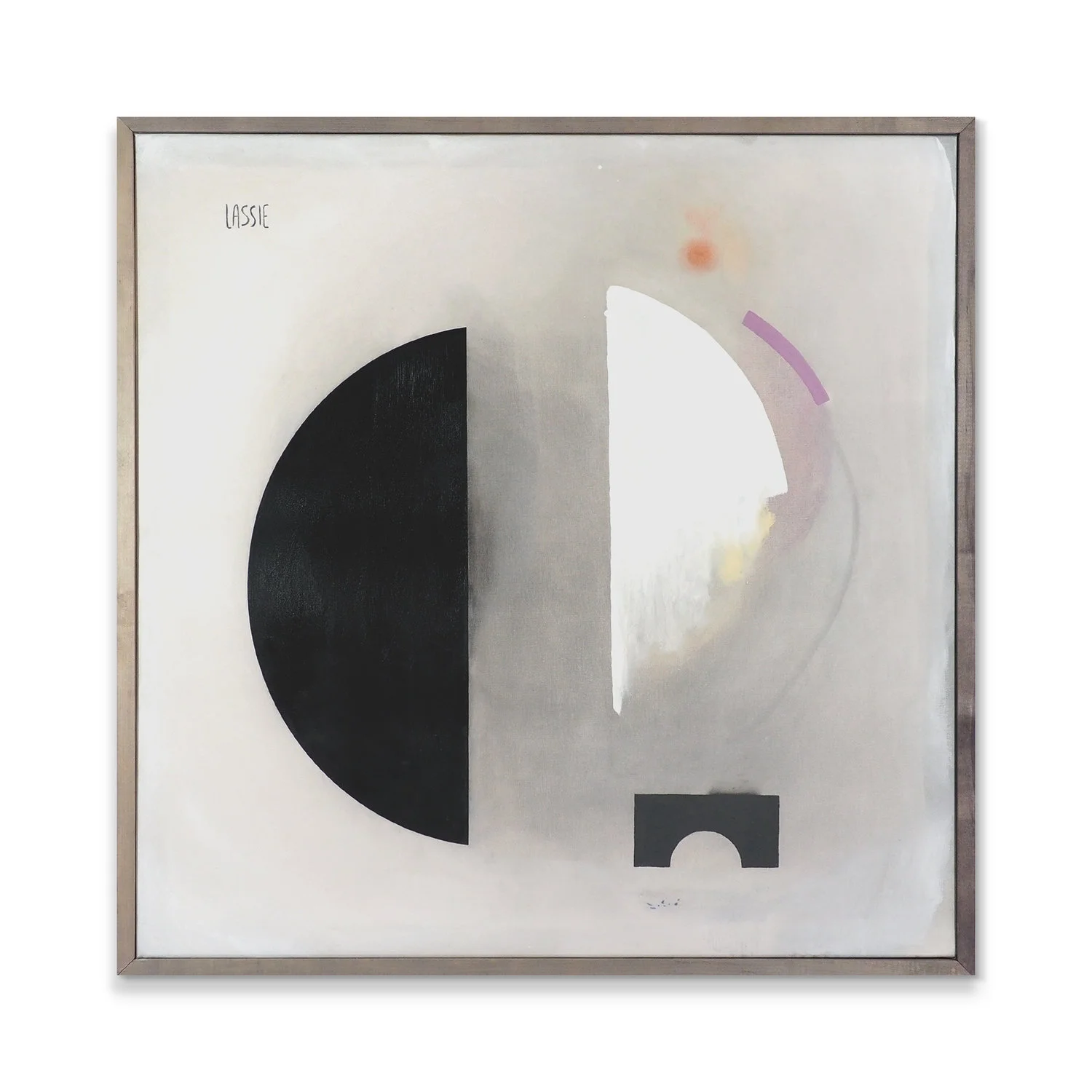
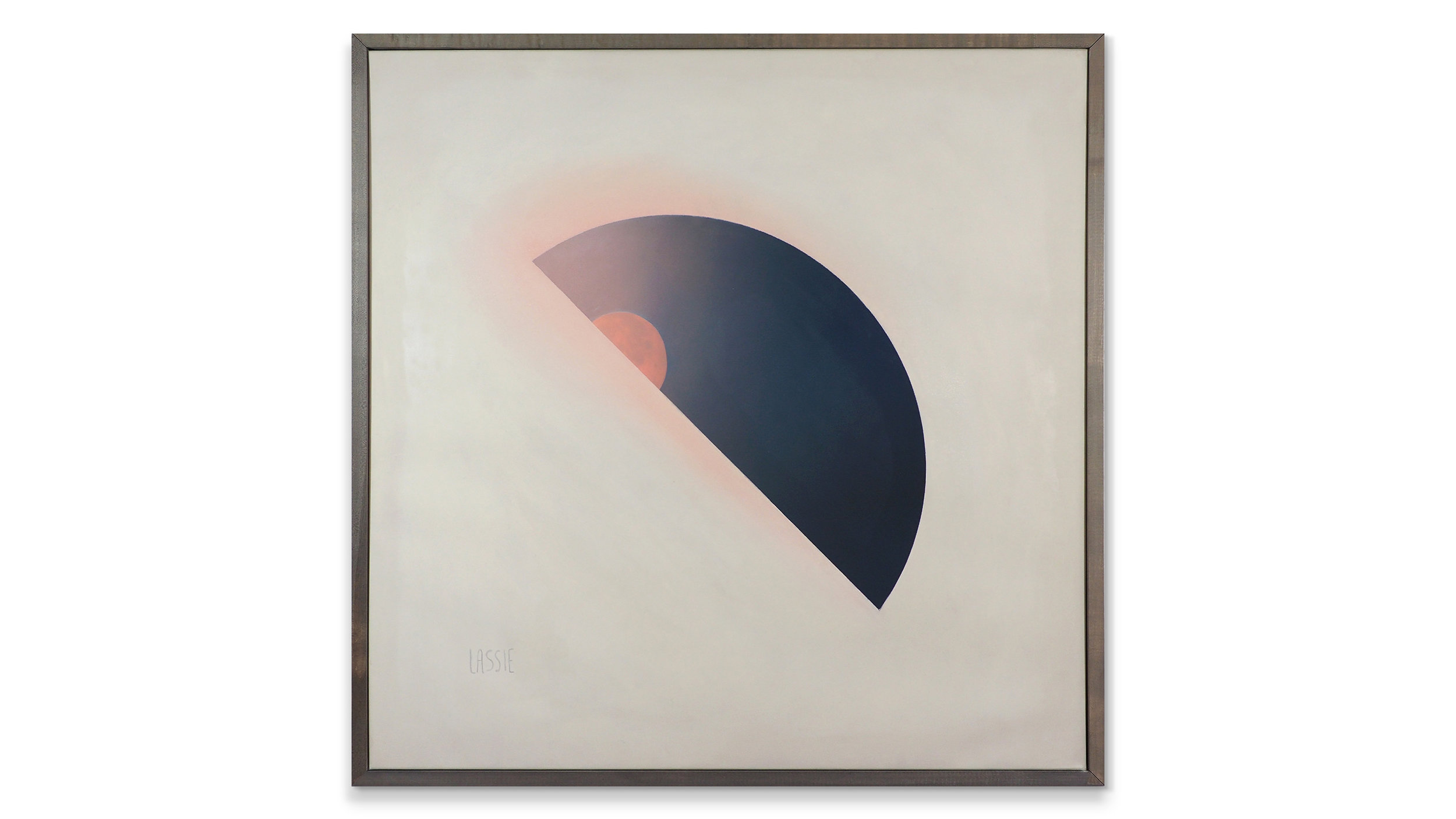
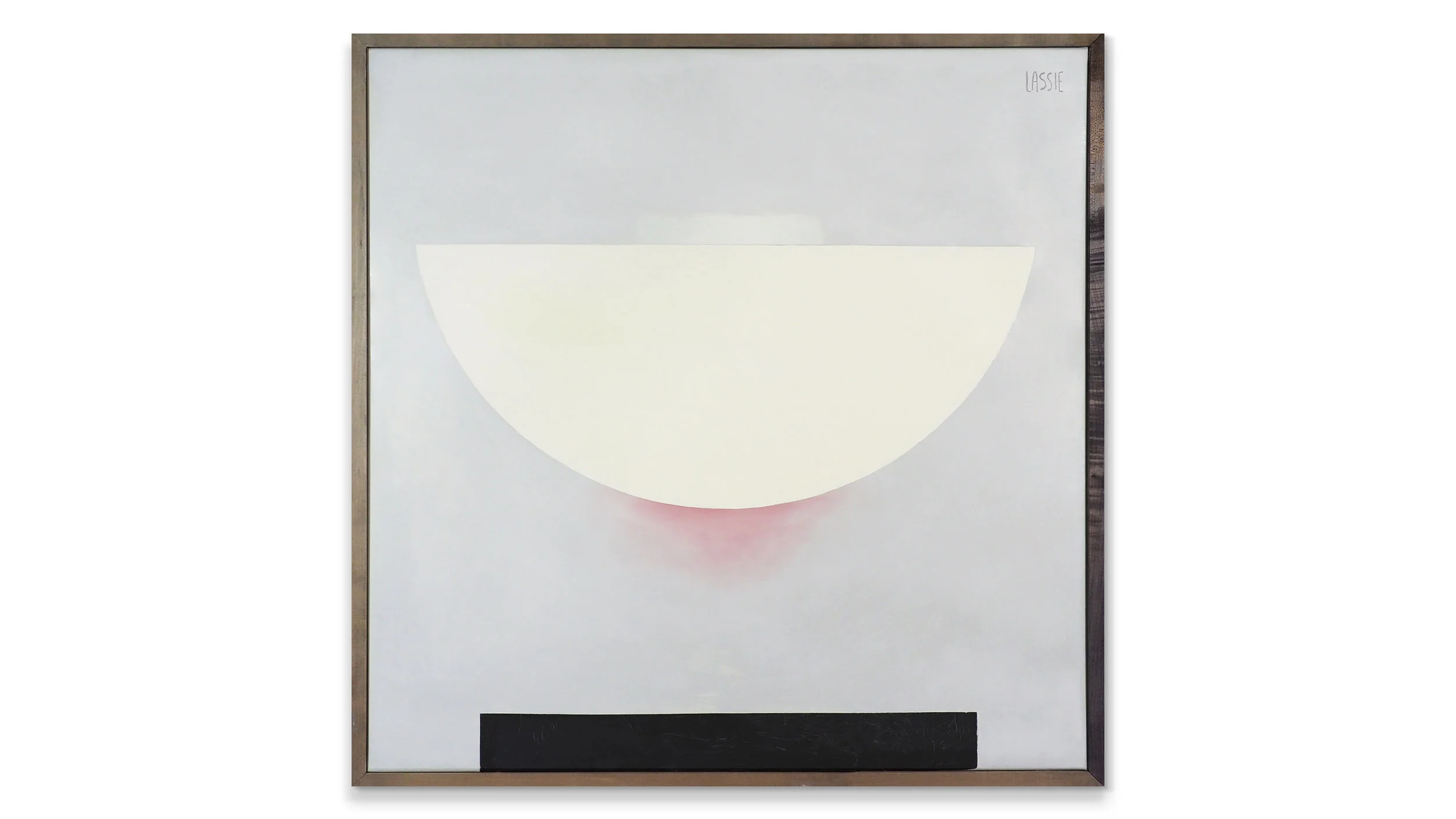
Here are some examples of the final pieces in Series One:
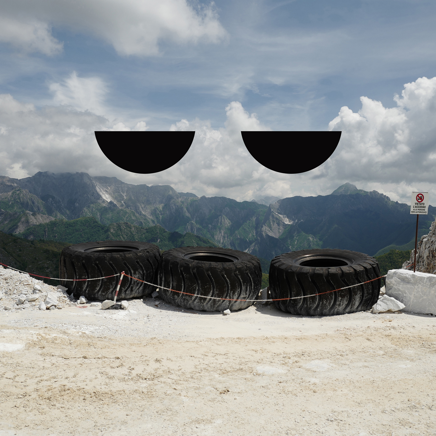
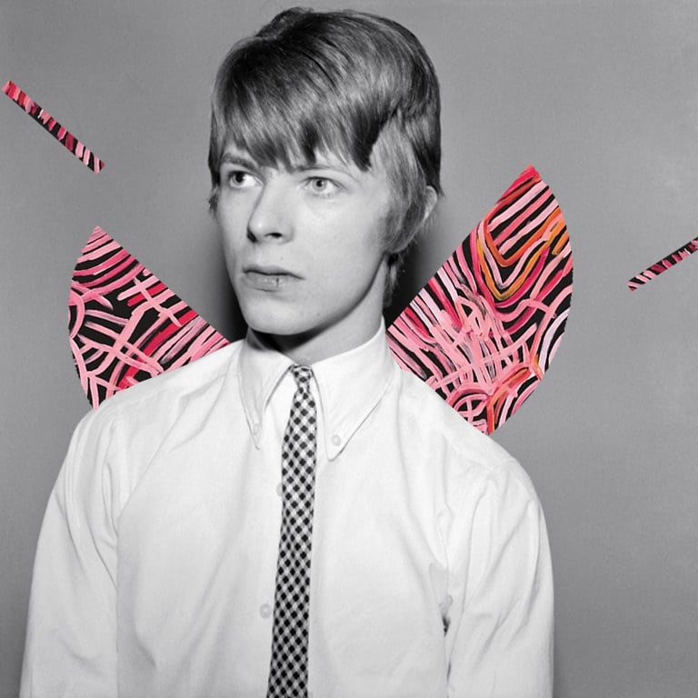
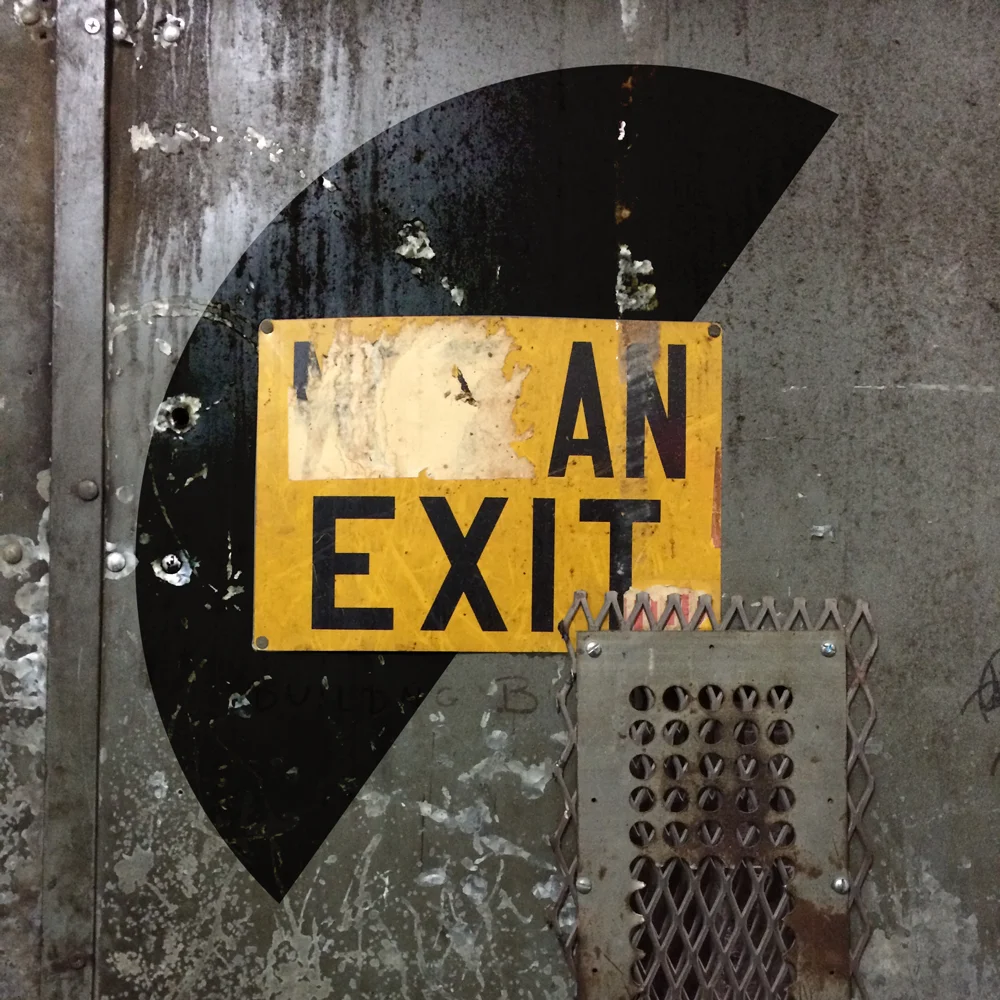
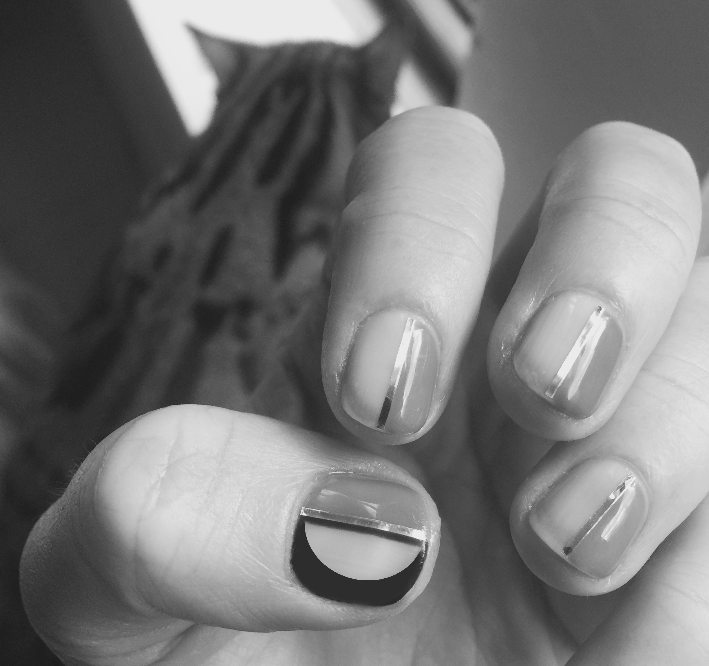
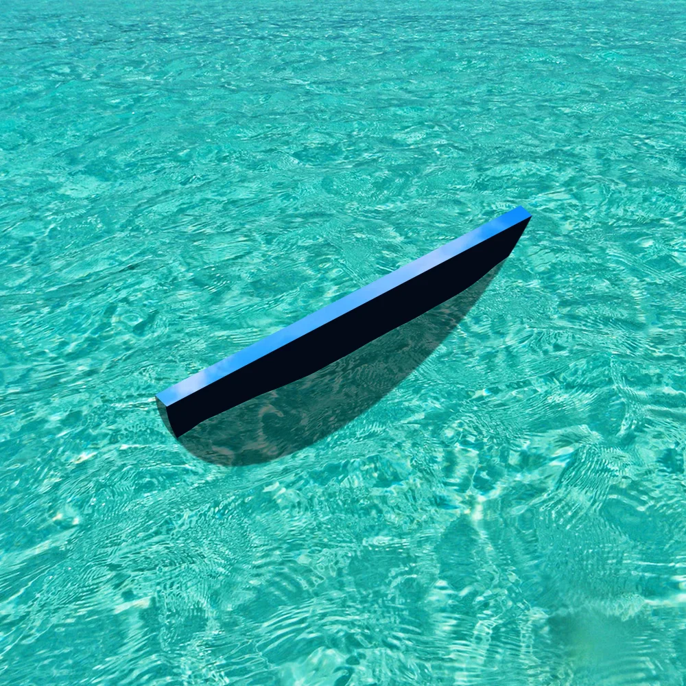
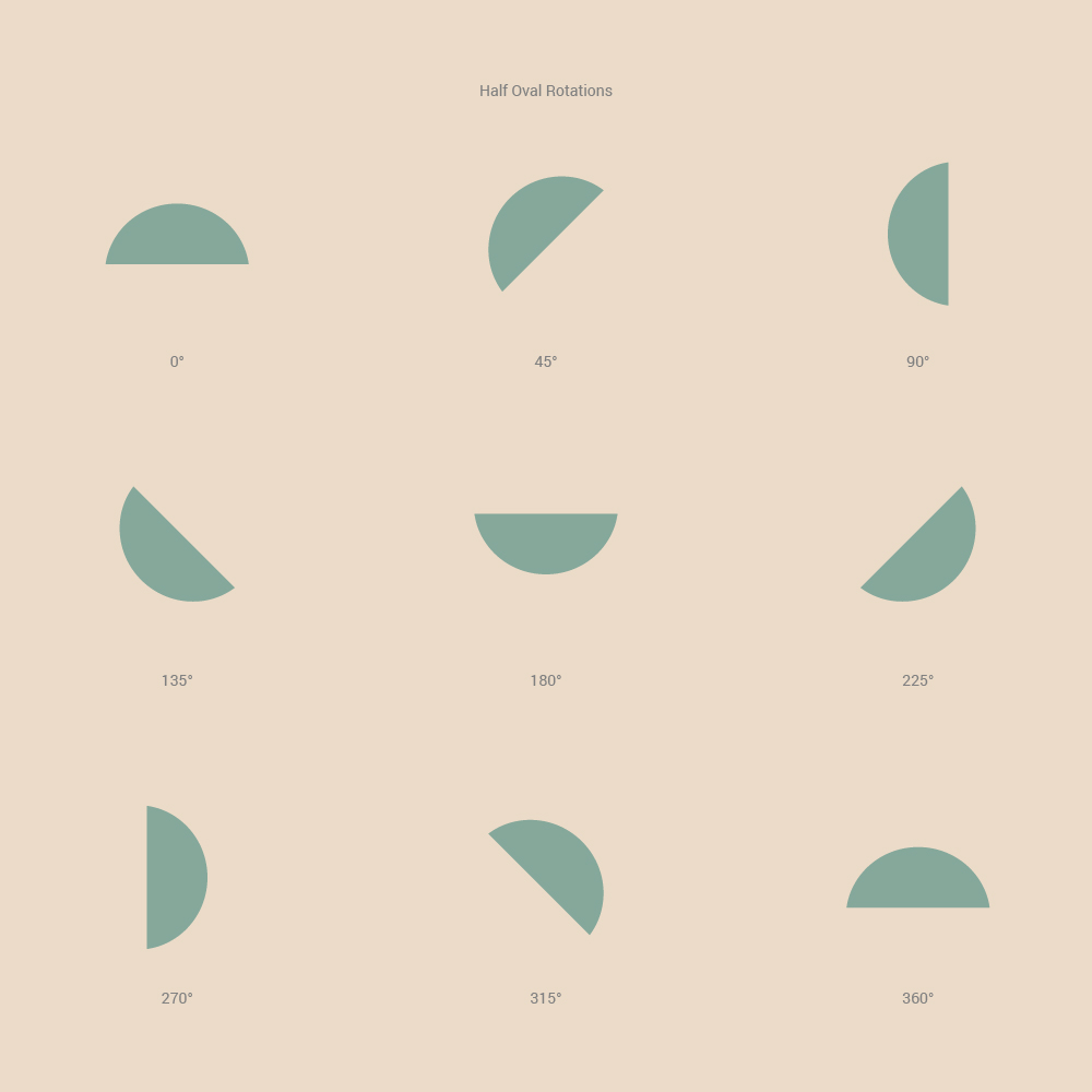
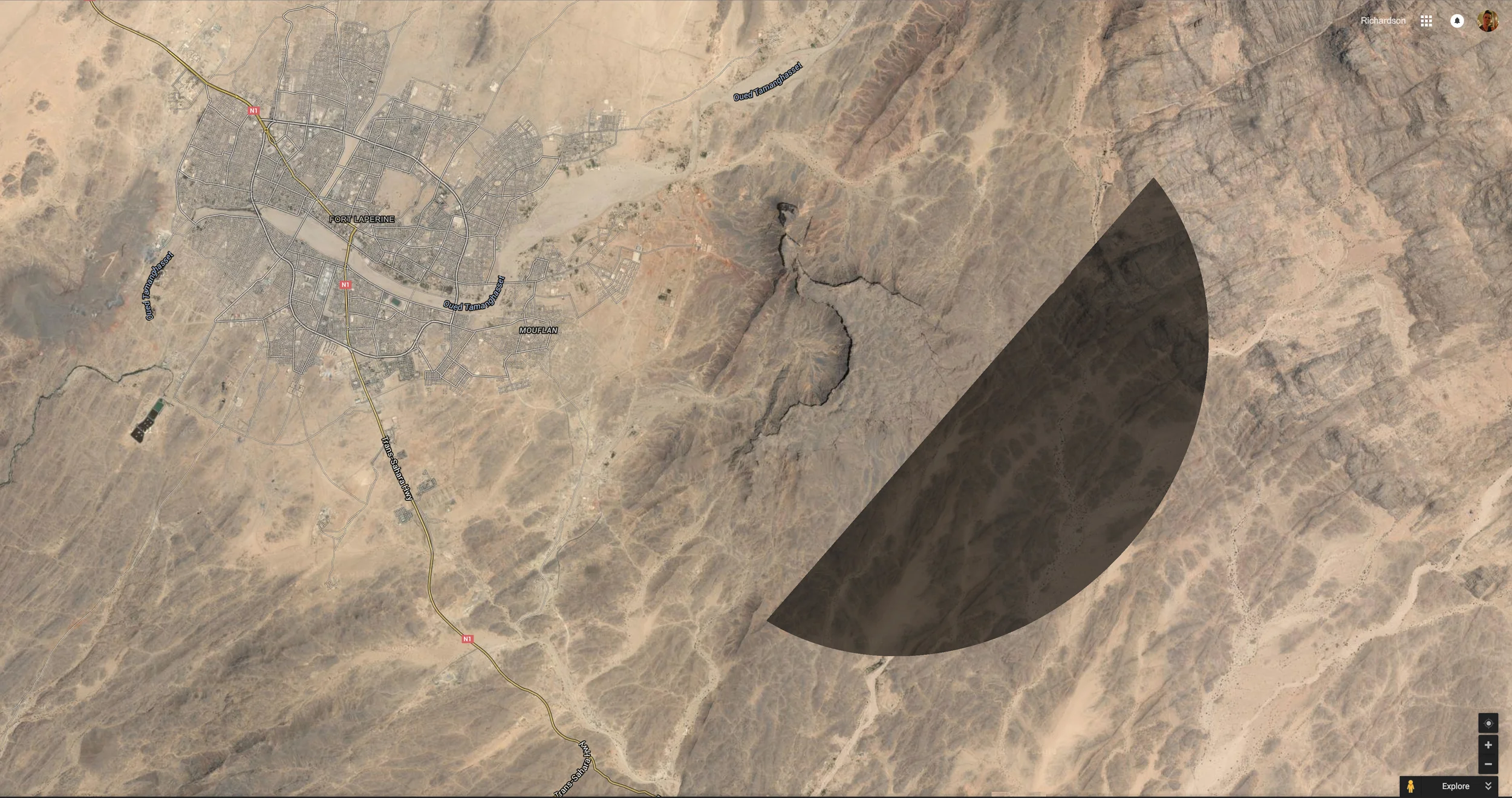
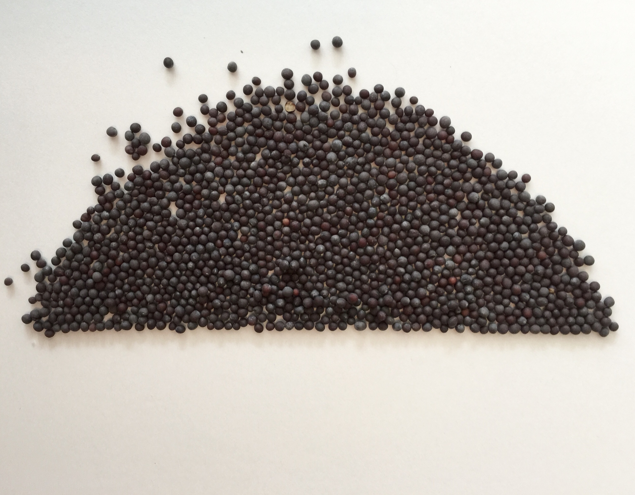
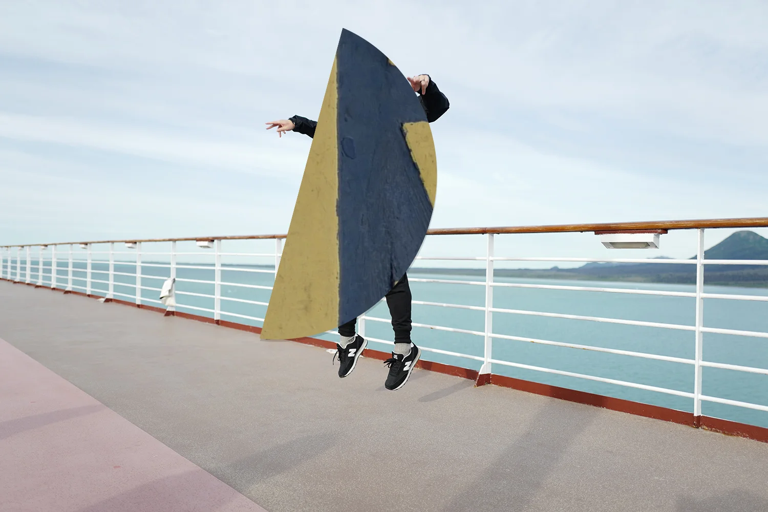
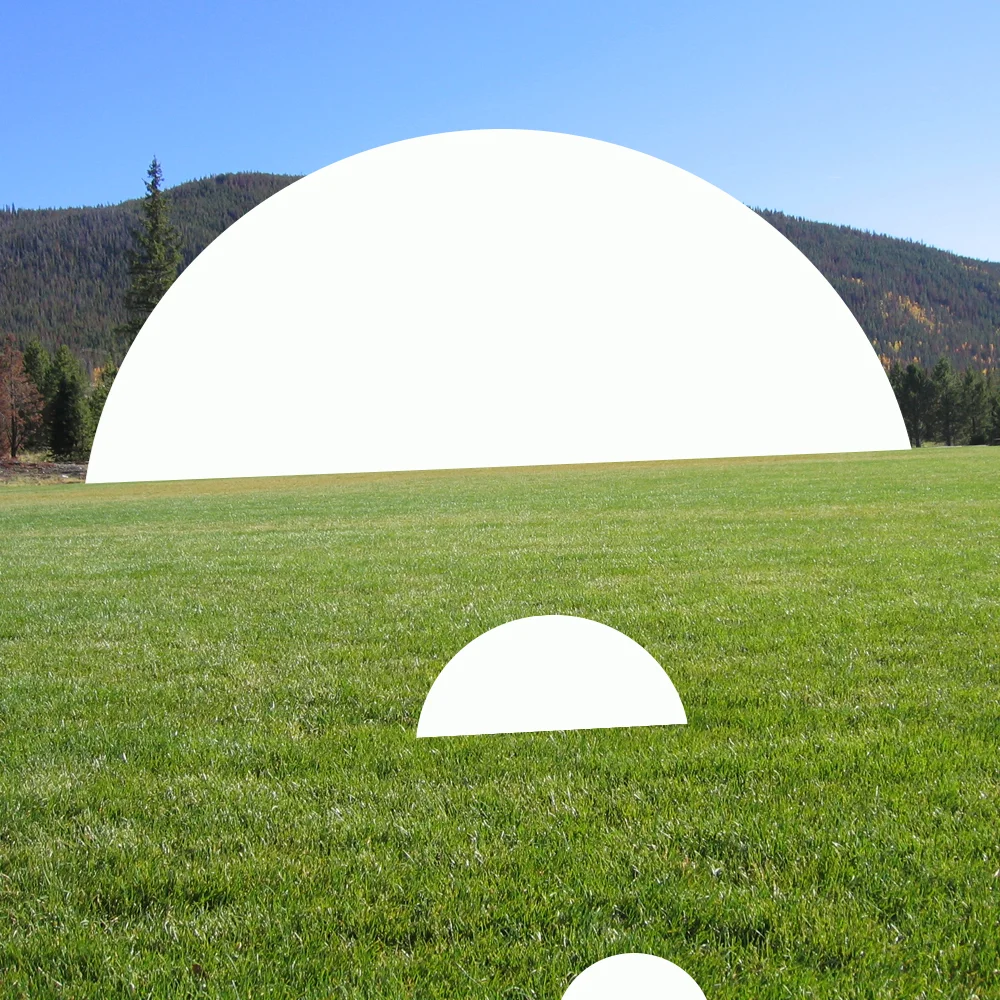
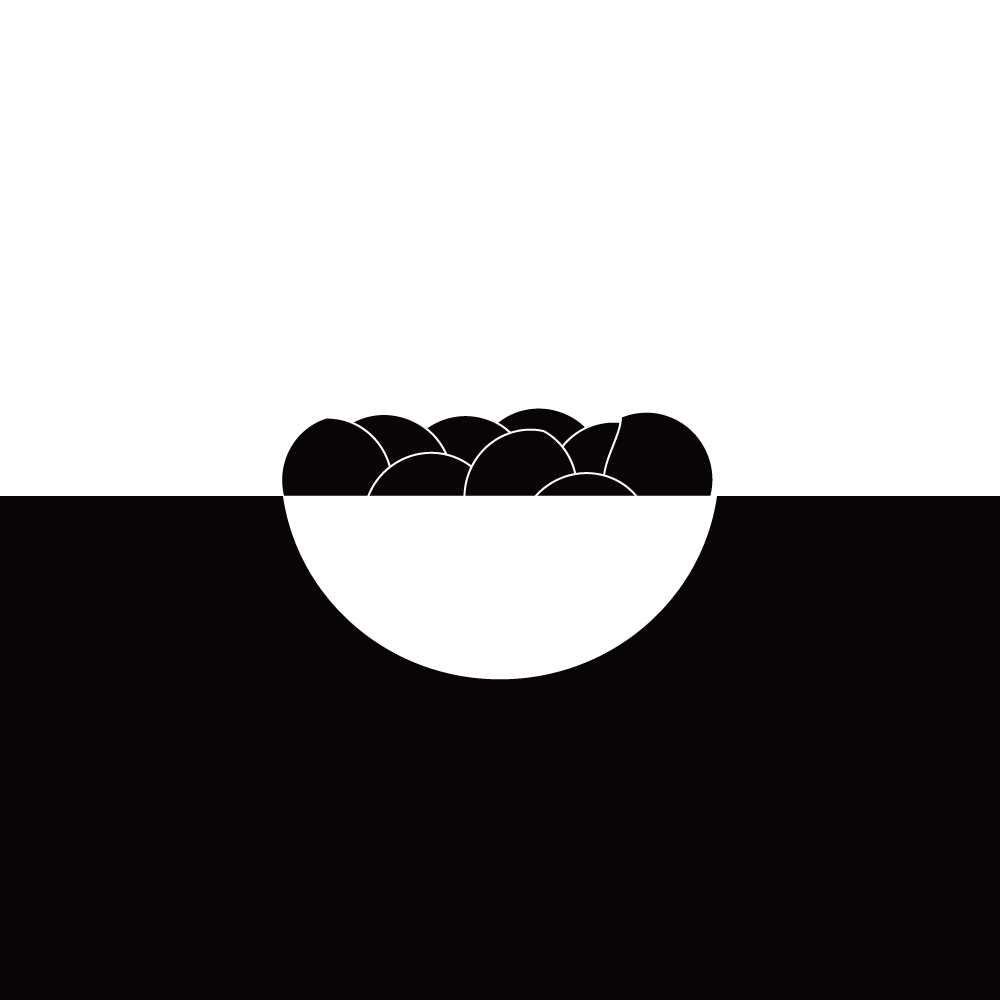
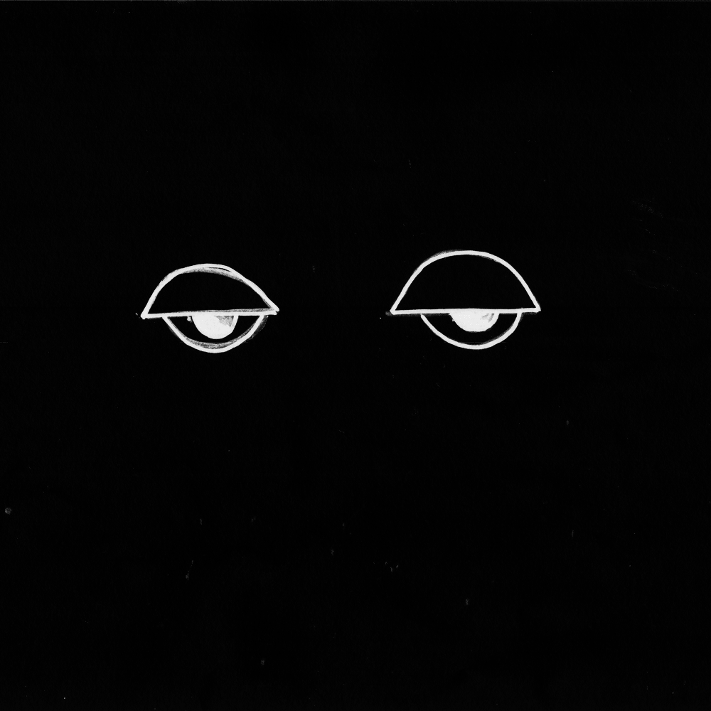
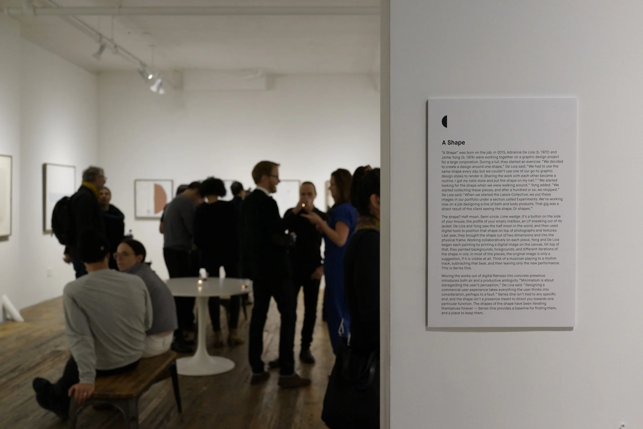
“A Shape” was born on the job. In 2015, Adrianne de Loia (b. 1972) and her team were working together on a graphic design project for a large corporation. During a lull, they started an exercise. “We decided to create a design around one shape,” De Loia said. “We had to use the same shape every day, but we couldn’t use one of our go-to graphic design styles to render it. Sharing the work with each other became a routine. I got my nails done and put the shape on my nail. We started collecting these pieces, and after a hundred or so, we stopped.” De Loia said. “When we started the Lassie Collective, we put these images in our portfolio under a section called Experiments. We’re working now on a job designing a line of bath and body products. That gig was a direct result of the client seeing the shape. Or shapes.”
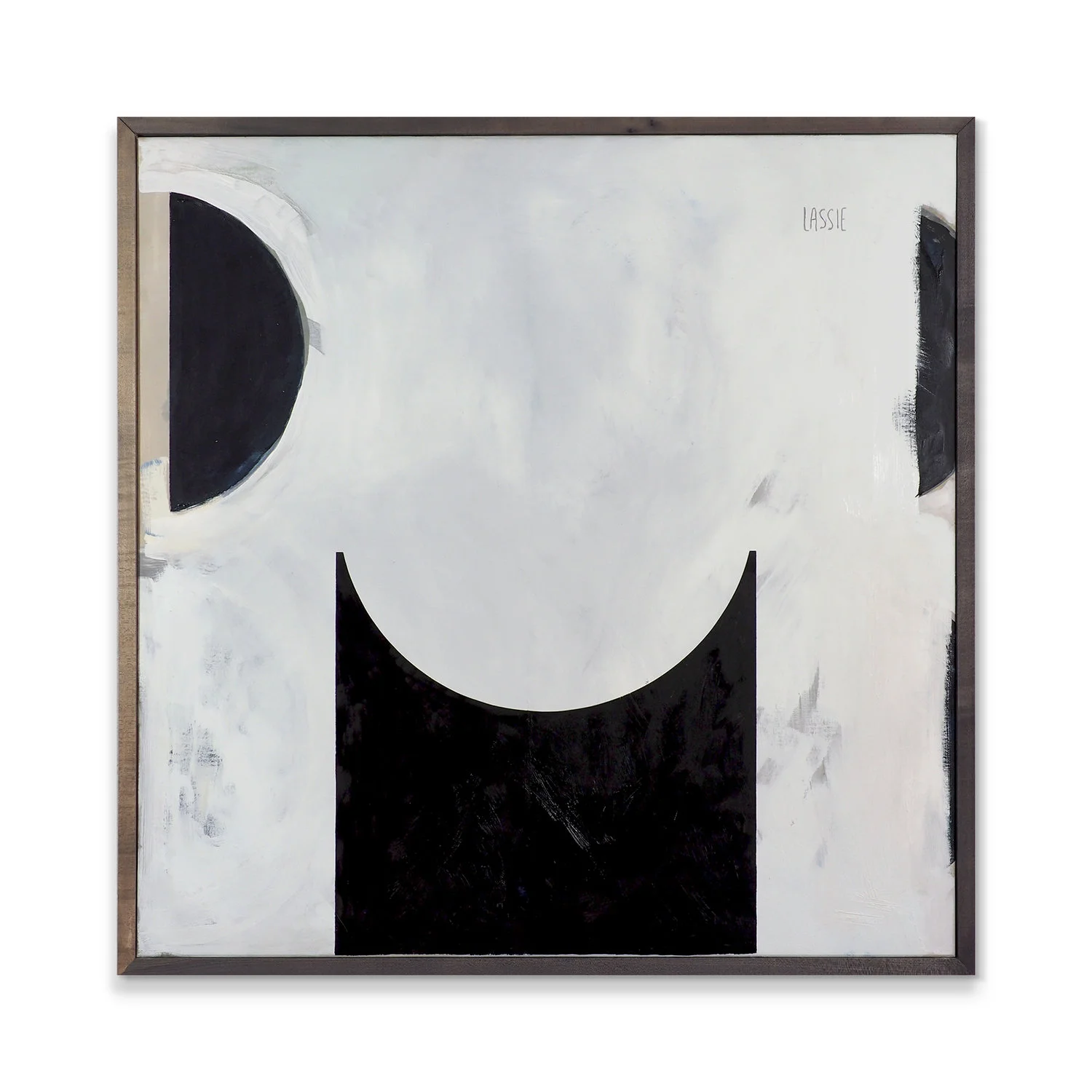
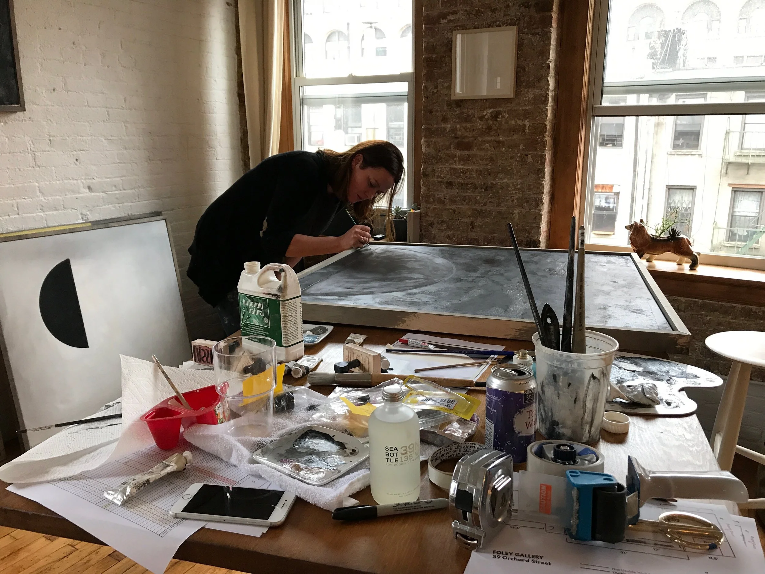
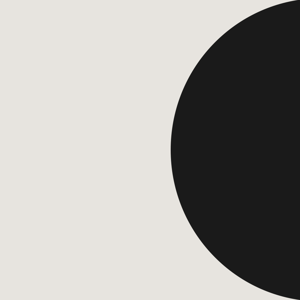
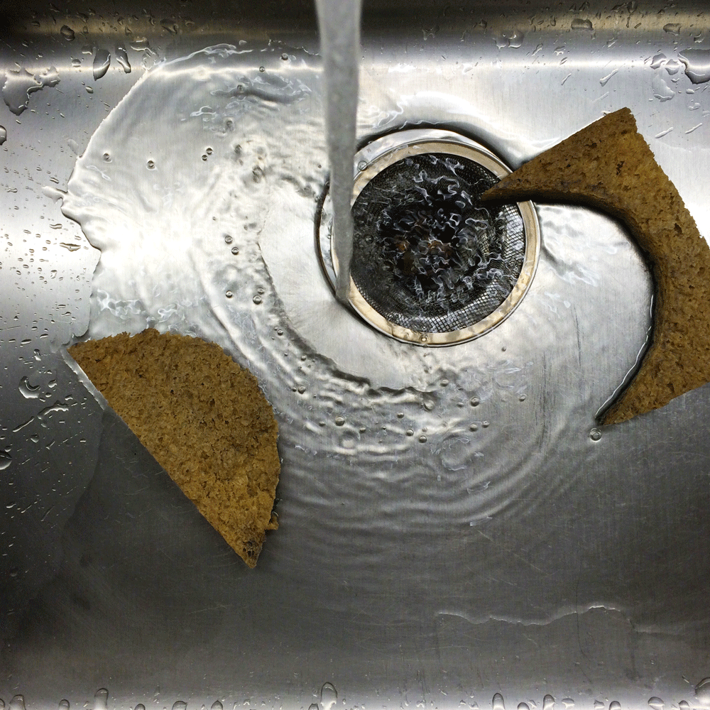
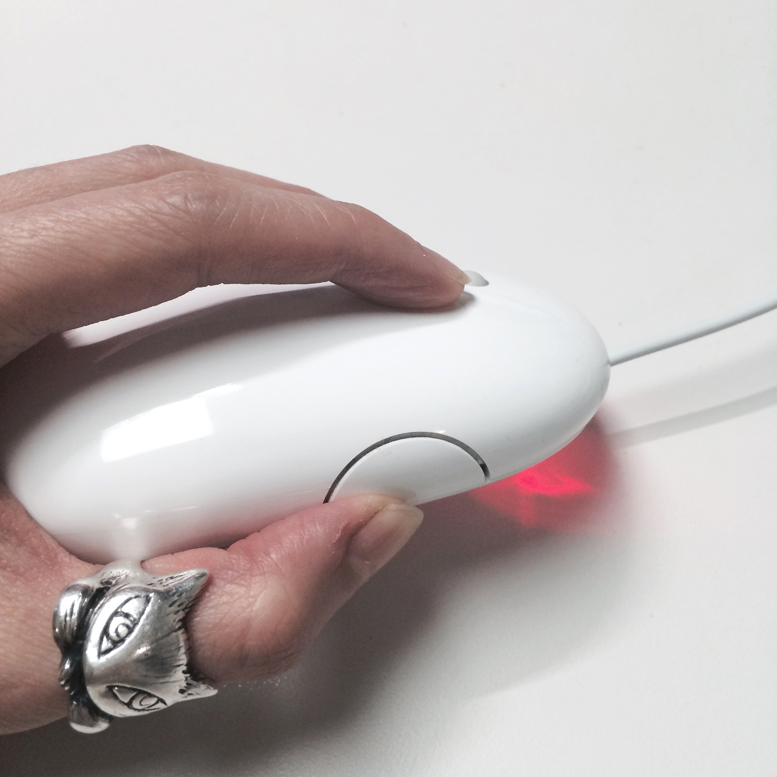
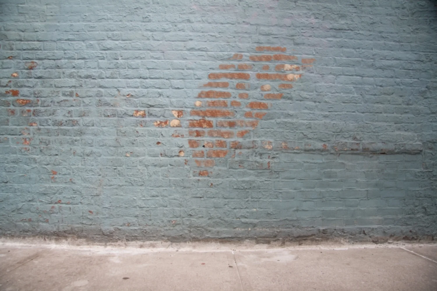
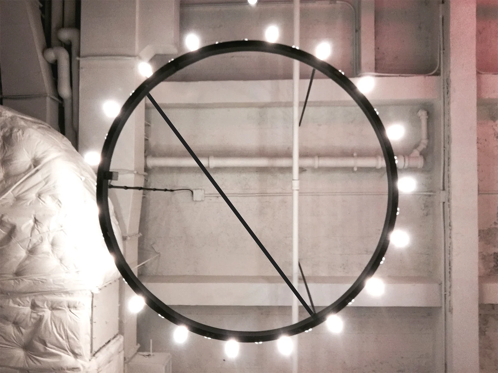
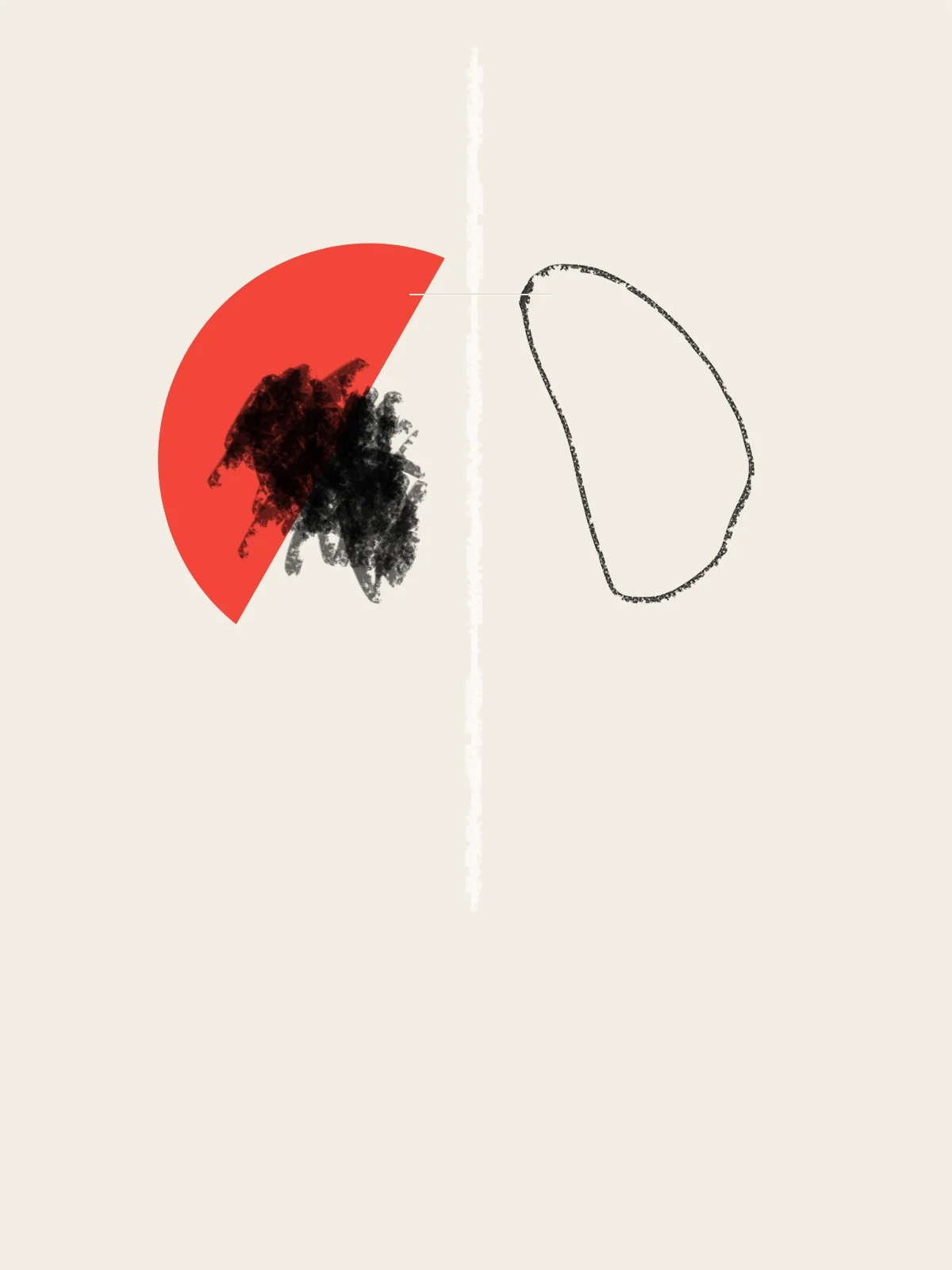
The shape? Half-moon. Semi circle. Lime wedge. It’s a button on the side of your mouse, the profile of your empty mailbox, an LP sneaking out of its jacket. De Loia saw the half moon in the world, and then used digital tools to position that shape on top of photographs and textures. Last year, they brought the shape out of two dimensions and into the physical frame. Working collaboratively on each piece, De Loia began each painting by printing a digital image on the canvas. On top of that, they painted backgrounds, foregrounds, and different iterations of the shape in oils. In most of the pieces, the original image is only a suggestion, if it is visible at all. Think of a musician playing to a rhythm track, subtracting that beat, and then leaving only the new performance. This is Series One.
Moving the works out of digital flatness into concrete presence introduces both air and a productive ambiguity. “Minimalism is about disregarding the user’s perception,” De Loia said. “Designing a commercial user experience takes everything the user thinks into consideration, perhaps to a fault.” Series One isn’t tied to any specific end, and the shape isn’t a presence meant to direct you towards one particular function. The shapes of the shape have been iterating themselves forever — Series One provides a baseline for finding them, and a place to keep them.
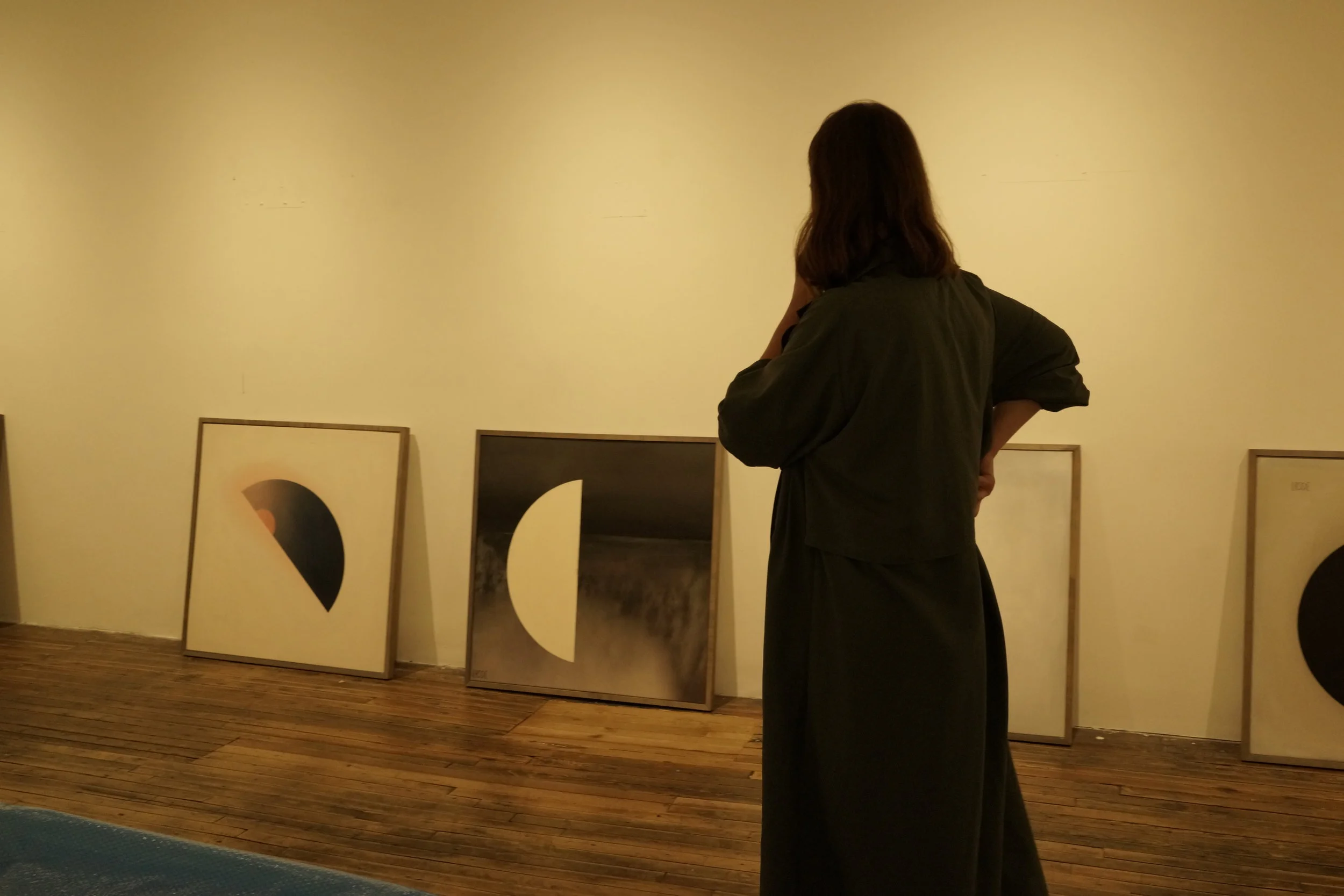
Getting ready for the show:

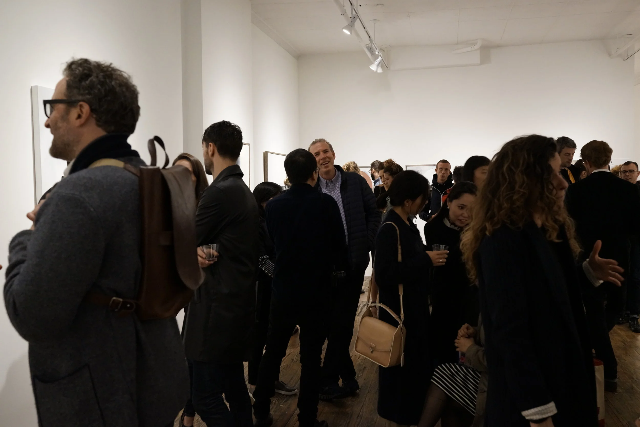
A great turnout for a rainy night in the Lower East Side...


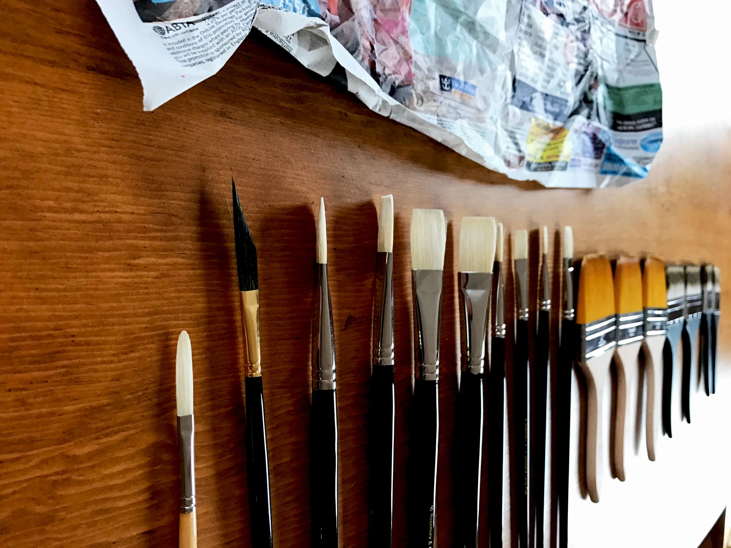
This was the best part, creating it: